Ten years after IXACT Contact Solutions launched its real estate CRM solution, its user interface gets a makeover, and even more new features.
Project
Custom Software Development, Application Modernization
Industry
Real Estate
Technology
Angular 4.0, .NET Core platform, SQL 2017
“We are odd in that we’re a software company without an in-house development team. With Whitecap, we get to benefit from a wide breadth of skills and people rather than have all those people in house. We can tap into the people and skills we need, when we need them.
CTO, IXACT Contact
About Ixact Contact
IXACT Contact Solutions Inc is a complete, easy-to-use cloudbased CRM and marketing solution targeted specifically to meeting the needs of real estate professionals. Headquartered in Toronto, IXACT Contact was founded in 2007, and is a sister company of Morris Real Estate Marketing Group.
The Challenge
IXACT Contact Solutions Inc first launched its customer relationship management (CRM) solution more than 10 years ago, offering real estate professionals a cloud-based and feature-rich system to manage customers, marketing and their business. Whitecap Canada helped IXACT Contact build the original software and continues to manage the infrastructure and work closely with IXACT Contact to add new functions and features.
“The original interface had simply become dated from a design and a user experience standpoint”
says CTO Jonathan Kay.
“It still delivered all the features our customers wanted but it wasn’t responsive, and we were starting to get feedback that the system looked dated.”
IXACT Contact was also expanding beyond individual agents to target real estate brokerages and corporate real estate offices. With that expansion came heightened expectations for a modern interface and application.
Rich Gaasenbeek, IXACT Contact’s Co-Founder and EVP says they could tell during sales calls that the user interface wasn’t wowing people, even if they had the rich functionality they’d want. “The user interface was something we had to sell around,” he admits. “Our competitors’ products looked fresher and more modern.”
They once again turned to Whitecap to give their user interface a major renovation.
The Solution
“The entire presentation layer was redone from the ground up,” says Kay, noting the work represents a significant application modernization. “When you incrementally add things over time, you lose sight of how big the entire solution has become.
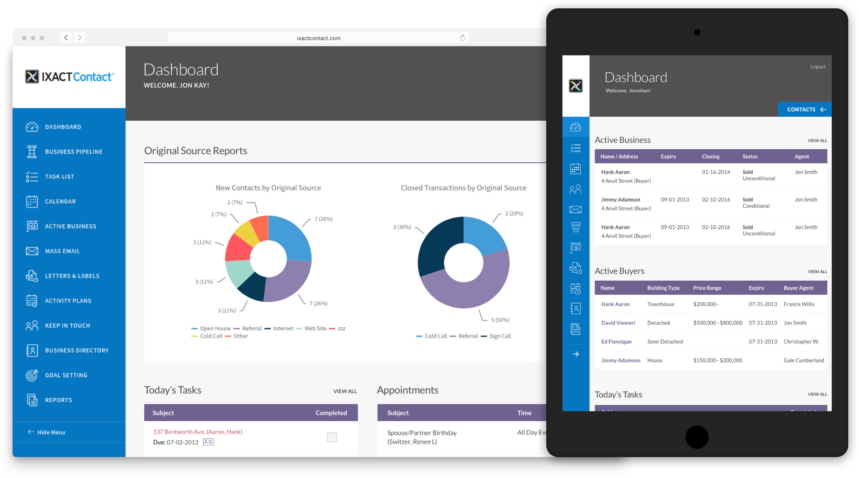
Priorities for the redesign included a modern interface, intuitive clean design and responsive to the wide range of screen sizes being used today. IXACT Contact also took the opportunity to add several important new features.

A COMPLETE OVERHAUL
Whitecap designed the new UI in Angular 4 to create the modern responsive environment, using a platform widely recognized for delivering fast applications and webpages.
The new UI allowed IXACT Contact to incorporate a completely configurable dashboard (which was not possible with the old UI). Agents can now choose which features they want front and centre when they log into the system, and they can move the widgets around so that their most important data is at the top.
The redesign let Whitecap designers incorporate a collapsible navigation panel so users can maximize screen space when they’re working in the system, and it’s responsive to take advantage of the different devices screen sizes from tablets to large screen monitors.
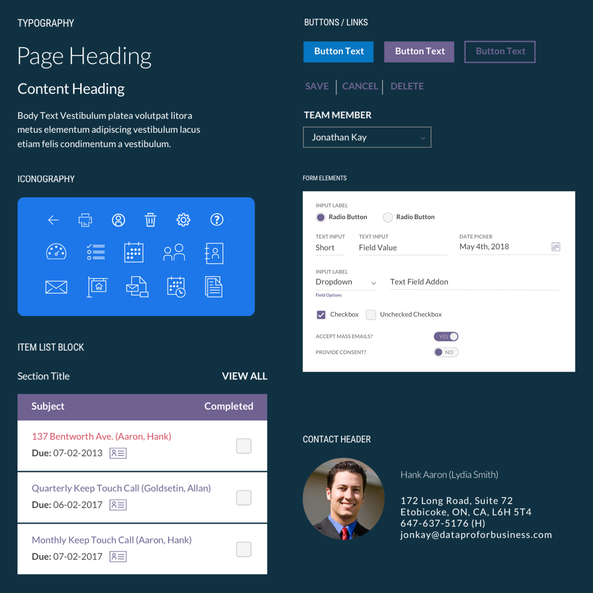
In addition, Whitecap designed simple, custom icons to provide a clean, consistent look for all aspects of the application while giving users simple visual cues so they can easily see what part of the application they’re in; making it even more intuitive and easy for users to move around seamlessly.
With the redesign, users aren’t constantly waiting for the system to pull data from the servers which could slow response time. The new system refreshes screens much more quickly and is more visually pleasing with consistent design elements and colours.
UI IS A COMPETITIVE ADVANTAGE
“The reaction was instant, and it was huge. When we opened the software, people said “Wow that’s nice,” recalls Gaasenbeek. “I remember thinking two things – thank god we did this and why did we wait so long.”
“Our interface has gone from being a handicap that we used to have to sell around, to being a flagship feature and a competitive advantage. The modern, clean, intuitive, responsive user interface is a selling feature,” Gaasenbeek adds. “Not only has the new UI helped us win new business and at a greater rate, but we’ve won new big business with brokerages and associations. It has also contributed in a big way to rapidly improving retention rates.”

“Prior to the new UI, we had a healthy growing business, but the launch of the UI has been an inflection point and the growth of our business has exploded”
Co-Founder and EVP
FEATURES ADDED – FUNCTIONALITY IMPROVED
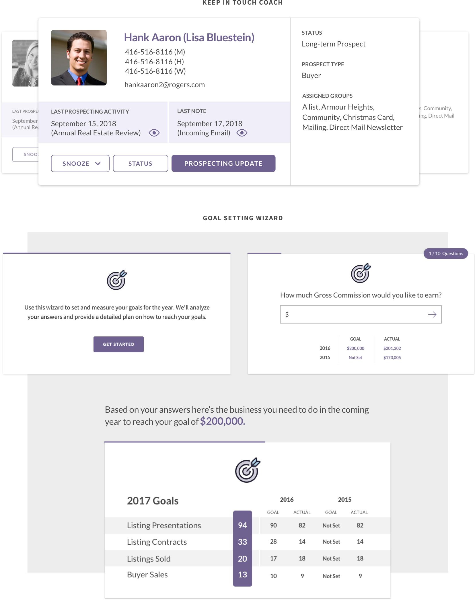
Some of the most popular new features launched with the new UI are “Goal Setting”, “Business Pipeline” and “Keep in Touch Coach”, configurable features that help agents set business goals, build their pipeline and keep connected with the customers and prospects so they can meet their business goals. It’s not a simple pop-up reminder but a more sophisticated contact engine that updates reminders and touchpoints based on specific criteria and a customers’ status.
The new business intelligence features help agents set annual goals and then sets out the daily weekly and monthly activities they need to reach those goals based on personalized data points about their performance (such as target commission, number of presentations to win listings, or number of listing they sell).
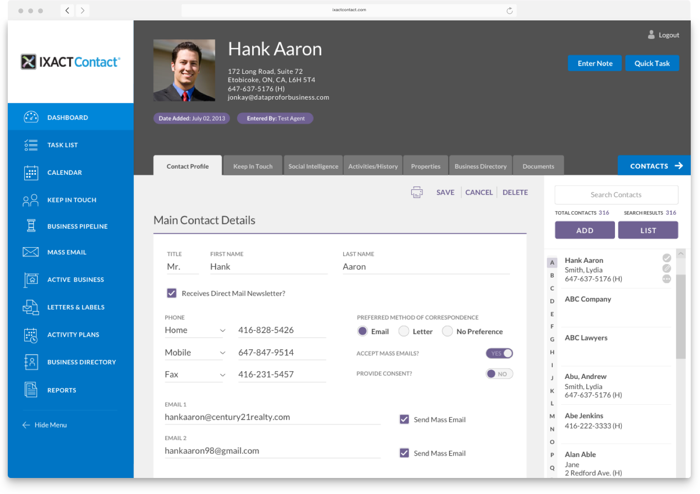
Through the redesign, IXACT Contact and Whitecap decided to take the opportunity to reconfigure the contact page, which is the heart of any CRM system. Leveraging some functionality available in the mobile app, users opening the contact page are in a “read only” mode. They can’t enter data by mistake and empty fields are hidden saving space on the screen. When they want to add information, they go into edit mode, which displays more fields for agents to capture more detailed information.

ROCK SOLID SOLUTION
IXACT Contact notes Whitecap’s team was instrumental in helping make sure their software, even after 10 years of growth and new features, remained robust and reliable.
“From day one they have helped us build an extremely robust and powerful platform,” says Gaasenbeek. “It’s not just a good product, it’s a rock-solid product and it has been extensible. When you look at the functionality today versus what we launched 10 years ago, the product is easily 7x larger and yet the foundation is so well designed and architected that we were able to expand the functionality without turning the system into a complex mess.”
When it came down to making sure the new UI would meet high expectations, Whitecap and IXACT Contact handled the extensive QA testing of the new features and regression testing of the main application to make sure all elements of the CRM system performed perfectly.
“It was a very heavy project and had some elements of risk for us because the UI touches every part of the system. We are thrilled with how it turned out.” Kay adds. “Getting our extremely large system redeveloped from the ground up and launching it at nearly perfect on the first release is a testament to Whitecap and our efforts.”

RESULTS & NEXT STEPS
Business Growth Exploding
Customer Retention Rates Up
Customers Love New User Experience
Software Becomes More Intuitive
Infrastructure and Solution Designed for Scalable Growth
Recognizing that their real estate agent customers use a wide array of devices, IXACT Contact is now looking at updating its mobile application platform and are talking with Whitecap about the right strategy for that application.